Rouse Coffee
Rouse is a personal design project I developed, imagining a serene coffee shop located in the heart of Chicago. This conceptual work delves into how intentional design—utilizing soothing colors and textures—can create a welcoming and cozy environment amid the city's fast-paced energy. Through this project, I was able to explore brand identity, customer experience, and the role design plays in shaping atmosphere, blending my love for both beauty and practicality.
-
adobe suite, premiere pro, lightroom, photoshop, illustrator, hubspot, salesforce, Canva
Moodboard & Process
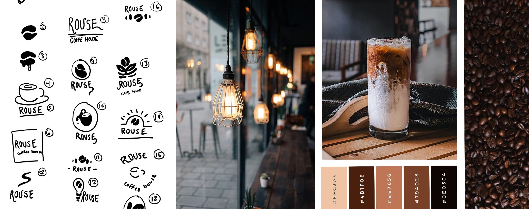
Inspiration images and sketches are always the first steps in creating my logos. The initial sketching process involves mind-mapping and generating keywords. Many of the images I used had dim lighting and high contrast, as I wanted to evoke a sense of the brand's image and how Rouse would be portrayed.
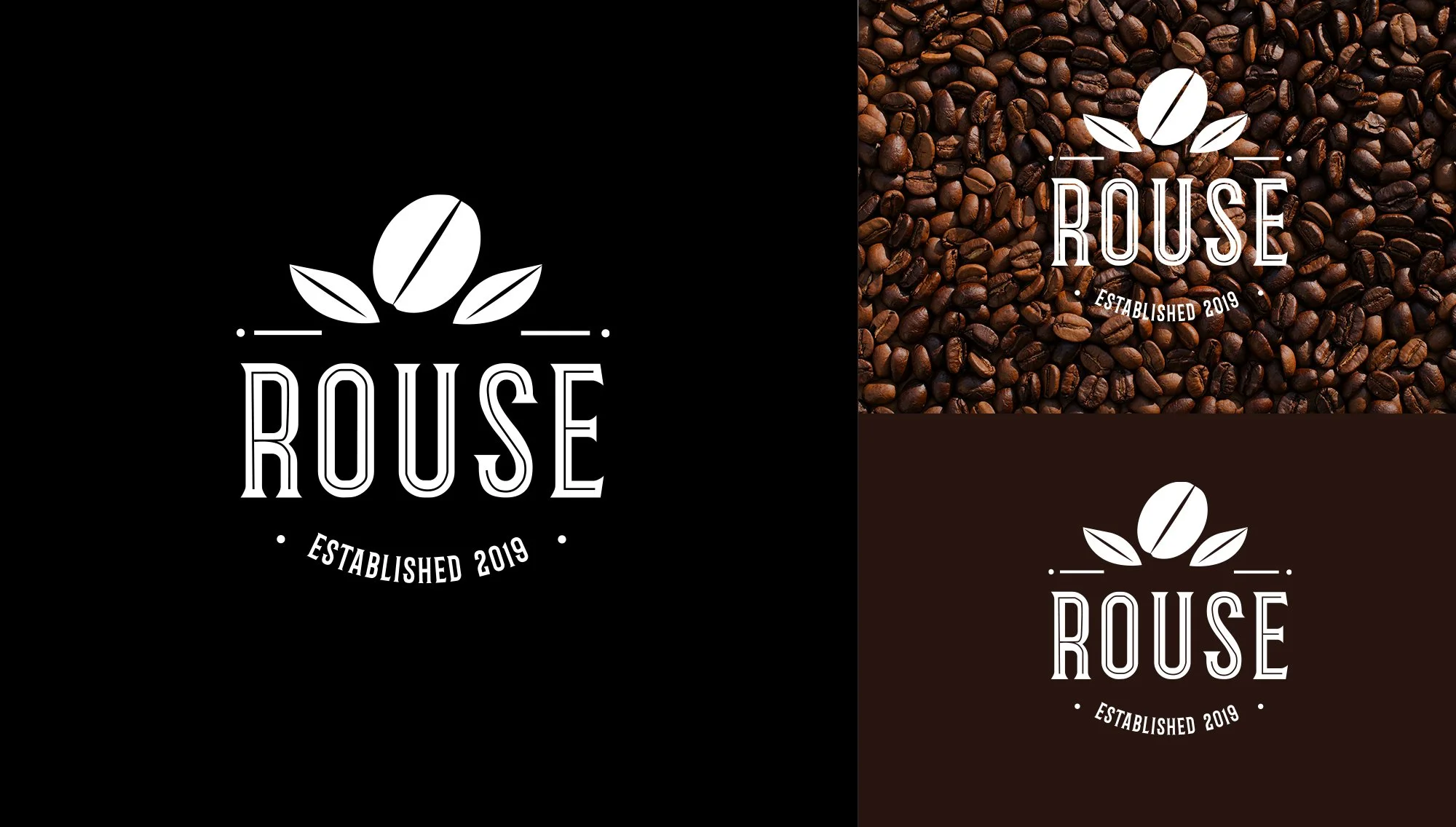
After completing the mood boards and brainstorming, I transitioned to selecting typefaces and color palettes for the brand. I focused on maintaining the dark and rustic tones that aligned with the overall mood. I was particularly inspired by the typeface Barbaro, which perfectly complemented the brand’s aesthetic, adding a touch of character and warmth to the design.
Color Palette & Typface
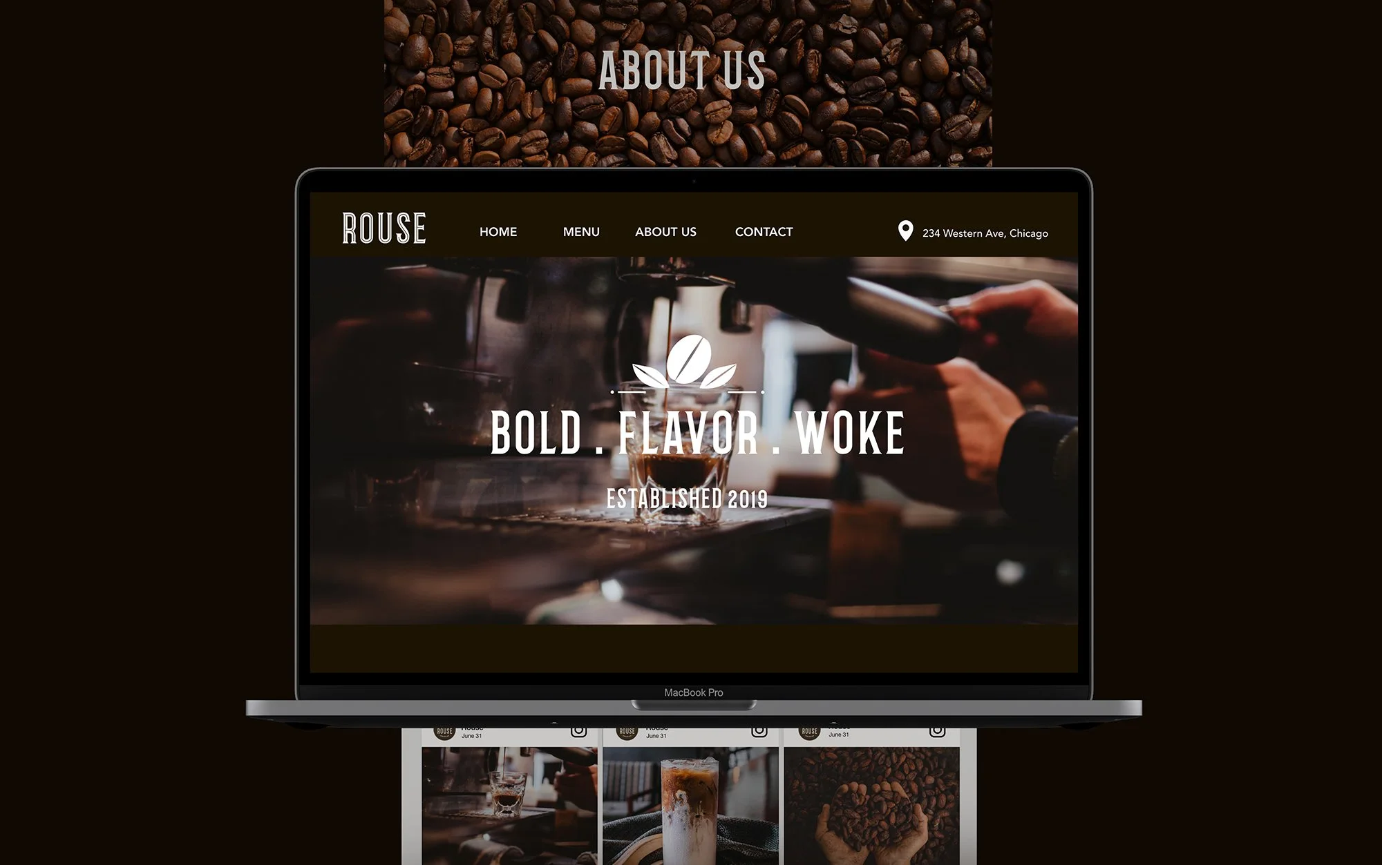
For the UI, I focused on ensuring an easy user experience with clear navigation while letting the visuals speak for themselves. The homepage prominently features high-quality coffee imagery, which gives the viewer an immediate sense of the brand's identity: Bold. Flavor. Woke. The use of sharp, elegant photography enhances this message, capturing the details of coffee brewing and cozy café moments.
UI Design
Design Approach
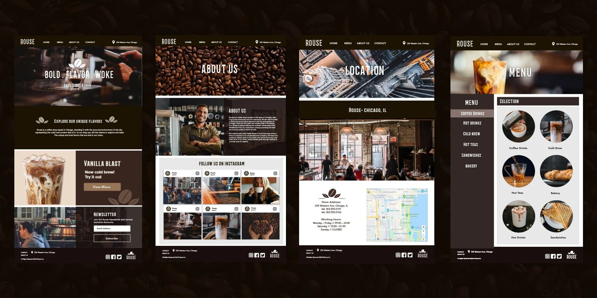
The About Us and Location pages were designed with storytelling in mind. By incorporating rich visuals of coffee beans, brewing moments, and a local vibe, I wanted the site to feel like more than just a café—it’s a community hub. The map integration for the location page enhances usability for customers, helping them find the café easily. The Menu section is crafted to make selections simple and engaging, showcasing each item with appealing visuals and a straightforward layout.
Key Pages
The packaging for Rouse Coffee reflects the same ethos as the brand's digital presence—bold, minimalistic, and focused on quality. I wanted to create packaging that feels as rich and carefully crafted as the coffee itself, making it instantly recognizable on the shelf or in the hands of a customer.
Packaging
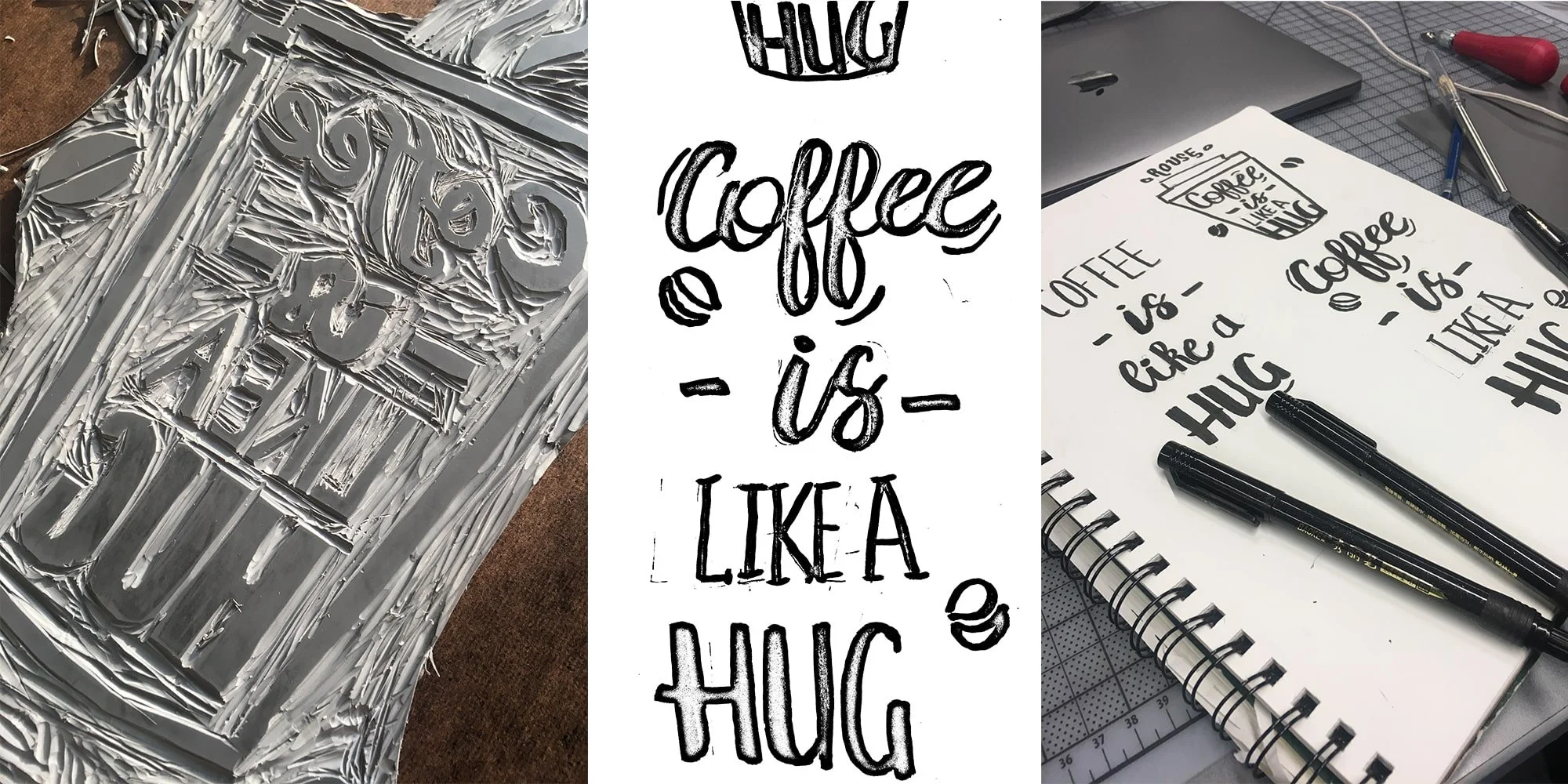
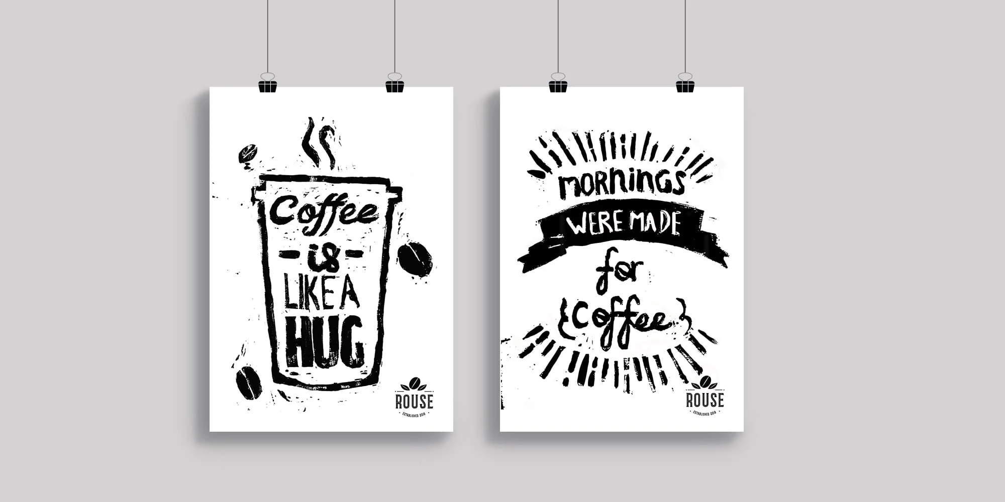
I had a blast creating lino print posters with the quote “Coffee is like a hug.” This hands-on process of sketching, carving, and printing really brought out the cozy, handmade vibe I wanted to capture. It’s a little imperfect but that’s what gives it character, just like a great cup of coffee. This was definitely one of my favorite parts of the project, as it added a personal and authentic touch to the brand.


